文章摘要
文章回顾了macOS图标的历史演变,探讨了从早期版本到现代设计的变化,展示了苹果公司在图标设计上的创新与美学追求。通过不同版本的对比,文章揭示了macOS图标设计如何随着技术进步和用户需求的变化而不断优化,反映了苹果对细节的极致关注。
文章总结
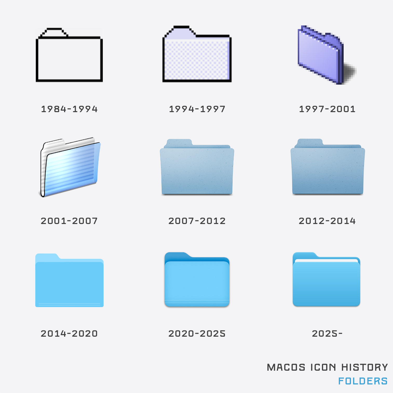
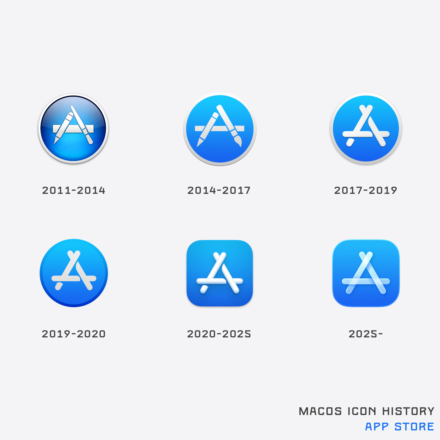
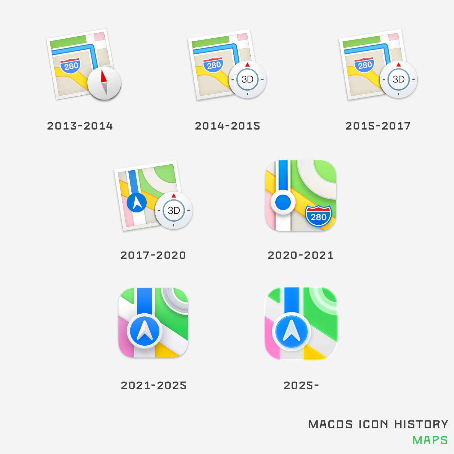
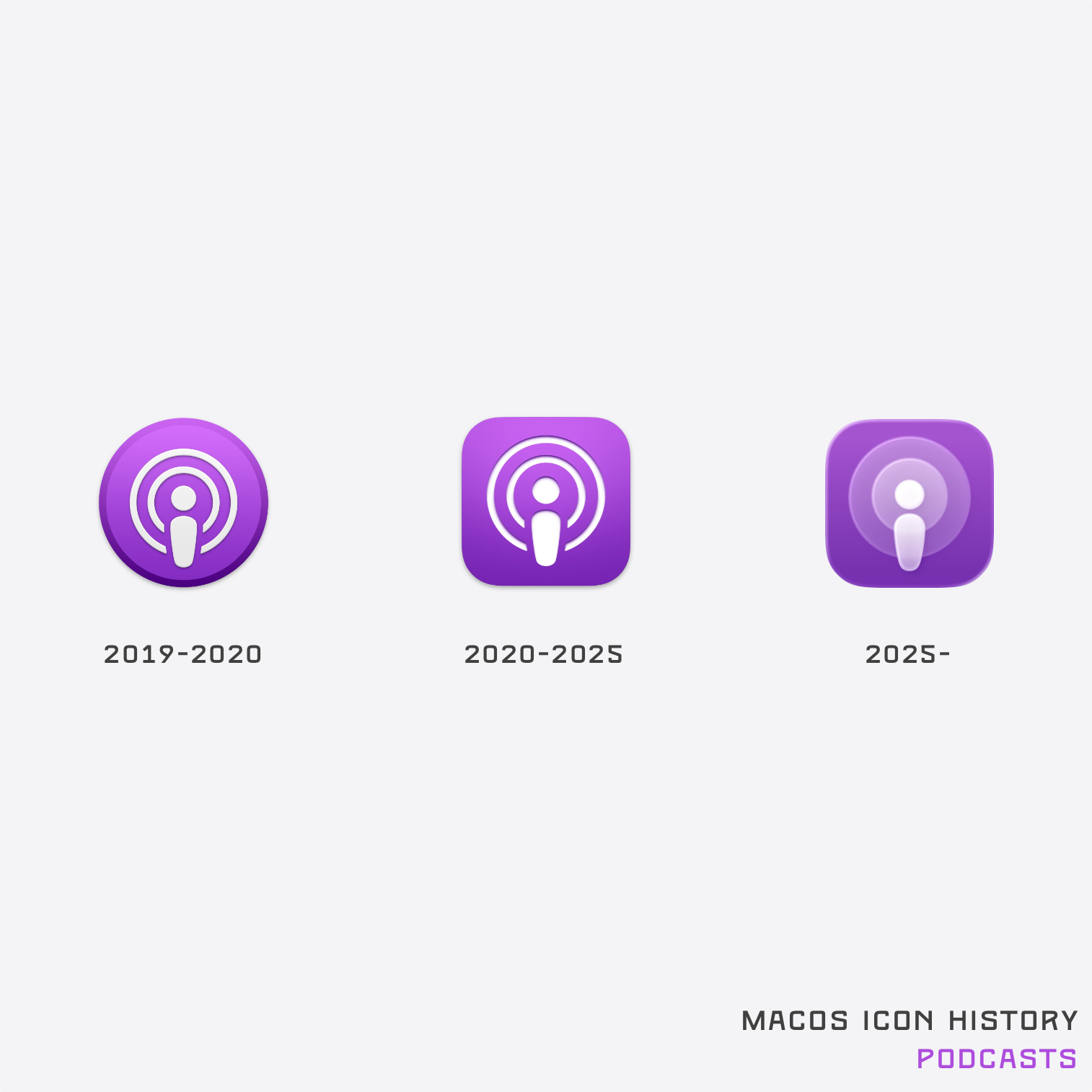
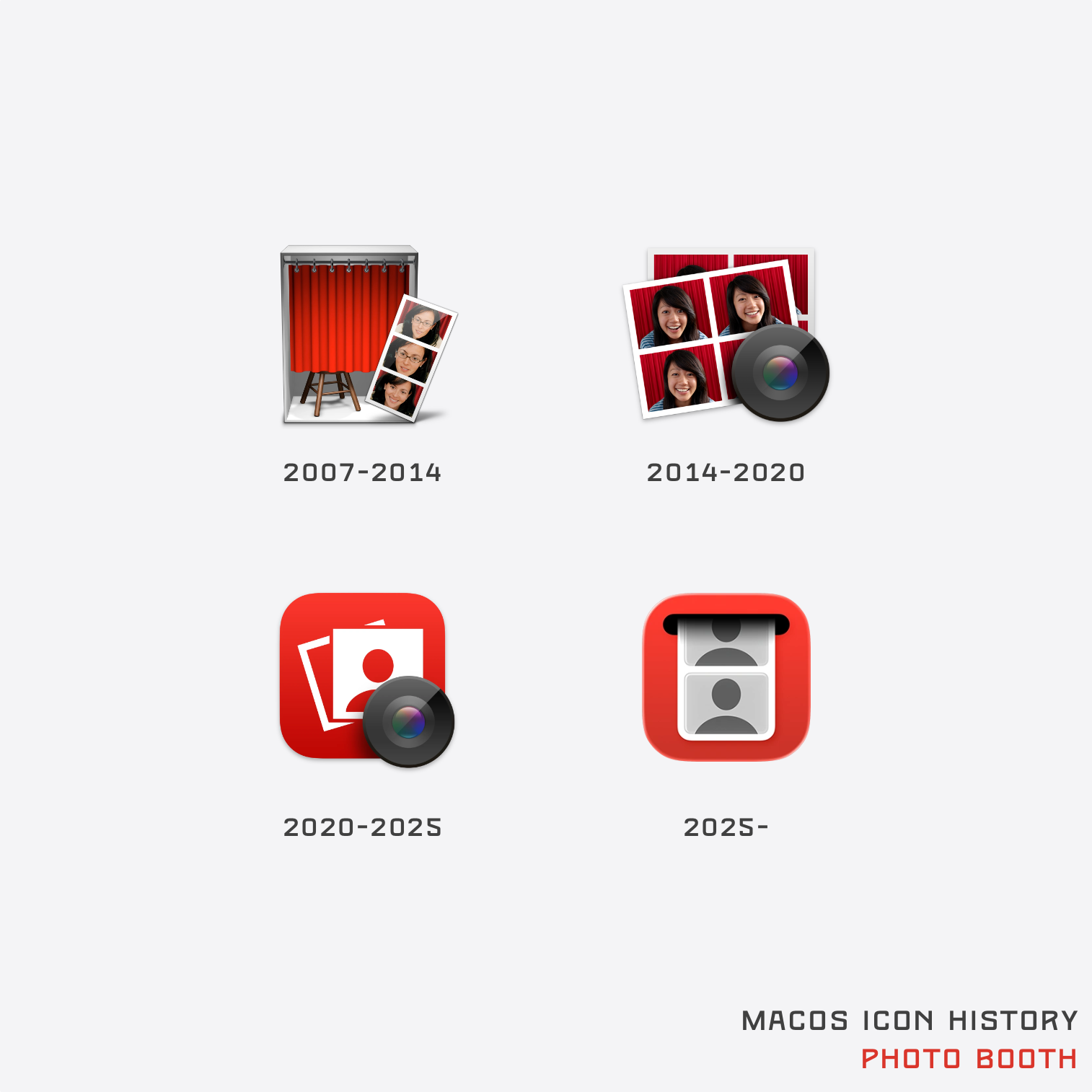
文章《macOS Icon History — Basic Apple Guy》详细记录了macOS系统图标在过去几十年中的演变历史。随着macOS 26的发布,苹果宣布了全新的用户界面设计——Liquid Glass,图标变得更加圆润、光滑,且取消了图标元素超出图标矩形的设计(如GarageBand、Photo Booth、Dictionary等应用的当前图标)。
作者BasicAppleGuy从2025年6月23日开始,逐步在社交媒体上发布并更新这一系列图标演变的内容,计划在整个夏季持续完善这一收藏。文章按时间顺序列出了更新历史,并展示了多个系统应用和图标的演变,包括:
- 系统偏好设置/设置

- 文件夹
- 便签

- 备忘录

- 信息

- 计算器

- 游戏中心

- 词典

- App Store
- 地图
- 播客
- Photo Booth
文章还提供了作者的社交媒体链接和联系方式,方便读者进一步了解相关内容。
评论总结
2025版图标的改进与历史对比
- prymitive:2025版图标比之前版本更好看,但相比2014版仍显逊色,清晰度和辨识度不如2014版。
引用:- "I find the 2025 versions to be a nicer looking than pre-2025 variants, so it’s overall an improvement."
- "But I also find the 2014 to be usually a lot better (clearer and more obvious)."
- alberth:2025版图标对比度低,模糊不清,辨识度较差。
引用:- "I find the 2025+ icon style difficult to discern."
- "Something about the lower contrast and fuzzier/blurs - makes the icons too muted for my liking."
- prymitive:2025版图标比之前版本更好看,但相比2014版仍显逊色,清晰度和辨识度不如2014版。
图标设计风格的变化
- danillonunes:苹果曾经以高质量图标著称,但现在所有图标都变成了圆角方形,失去了独特性。
引用:- "Apple’s distinguished features was their high-quality icons."
- "Now everything is this sad rounded cornered square."
- fainpul:macOS图标过于追求细节和写实,违背了图标应简洁、极简化的原则。
引用:- "macOS has a history of app icons which are highly detailed and almost photo-realistic."
- "This is exactly the opposite of what a good icon should be like (reduced, stylized, simplified to the extreme)."
- danillonunes:苹果曾经以高质量图标著称,但现在所有图标都变成了圆角方形,失去了独特性。
特定图标的演变与评价
- russellbeattie:App Store图标的演变从绘图工具到透明冰棒棍,最具趣味性,但Game Center的彩色气泡图标最差,缺乏明确含义。
引用:- "The evolution of the App Store icon from drawing utensils to transparent popsicle sticks is definitely the most interesting."
- "Game Center is definitely the worst. The bubbles have never represented anything remotely intelligible."
- dsego:系统偏好设置图标有所改进,2020版看起来像是AI生成的。
引用:- "At least the system preferences icon has improved, the 2020 one looks like it’s AI generated."
- russellbeattie:App Store图标的演变从绘图工具到透明冰棒棍,最具趣味性,但Game Center的彩色气泡图标最差,缺乏明确含义。
历史与怀旧
- rhet0rica:缺少NeXT和Rhapsody时期的图标,这些版本对后续程序有重要影响。
引用:- "Tragically missing the NeXT and Rhapsody versions that preceded many of these programs."
- "Rhapsody DR2 has its own Stickies icon that got skipped."
- burnt-resistor:怀念SIP之前的Finder插件,可以自定义特殊文件夹的图标。
引用:- "I miss the Finder plugsins pre-SIP that overrode built-in and added custom icons for special folders."
- rhet0rica:缺少NeXT和Rhapsody时期的图标,这些版本对后续程序有重要影响。
图标设计的实验性与多样性
- nntwozz:iTunes图标经历了多次实验性设计,是UI创新的试验场。
引用:- "A lot of experimentation went on with the iTunes icon in particular."
- "It was the UI playground for new ideas before they would release in the next OS version."
- nntwozz:iTunes图标经历了多次实验性设计,是UI创新的试验场。
总结:评论者对2025版图标的改进持肯定态度,但认为其清晰度和辨识度不如2014版。苹果图标设计从高质量、独特风格转向圆角方形和过度写实,引发争议。特定图标的演变(如App Store和Game Center)受到关注,部分设计被认为缺乏明确含义。此外,评论者怀念早期版本的图标设计和自定义功能,认为历史版本对现代设计仍有重要影响。